Borehole Data and Climate Reconstruction
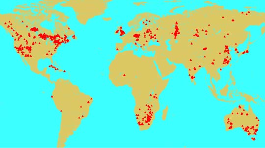
The map above shows the location of the borehole sites in the database that
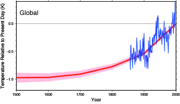
we have analyzed to date. The diagram below is a global perspective of the
surface temperature change over the last five centuries, averaged from
1012 individual reconstructions. The thick red
line represents the mean surface temperature since 1500 relative to the
present-day. The shading represents ± one standard error of the mean.
Shown in blue for comparision is the global mean surface
air temperature (five year running average) derived from instrumental
records by P.D. Jones and colleagues at the University of East
Anglia <http://www.cru.uea.ac.uk/>.
Welcome to the Borehole Temperatures and Climate Reconstruction Database
Back to Borehole Temperatures and Climate Reconstruction Homepage